Choosing the Right Size and Distance for UI
January 6, 2024
Designing a virtual reality user interface (UI) and understanding spatial design concepts isn’t the same as creating apps on your mobile or desktop devices. There are three fundamental concepts you need to keep in mind when you’re going to create and test a UI panel for your VR experience: size, height, and distance.
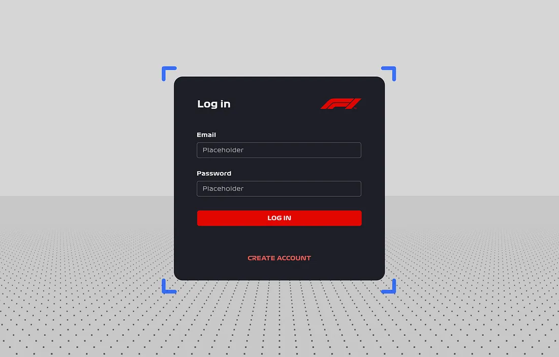
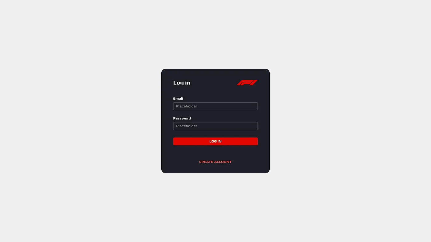
In this article, we’ll be creating a UI in Figma and testing it directly in VR using ShapesXR. We’ll determine the ideal size and height, and explore how distance can affect the overall experience. For the sake of this tutorial, we’ll use a simple login interface positioned one meter from the user. Don’t worry if that sounds oddly specific, all the principles we cover can be applied to any 2D interface you're designing in VR.
To follow along, you’ll need:
- ShapesXR
- The link to this space (Space Code: 9r d9 d4 w6)
- This Figma template (and a Figma account)
Once you have everything you need, keep on scrolling for tips on spatial design concepts, and a quick guide to designing a VR UI.
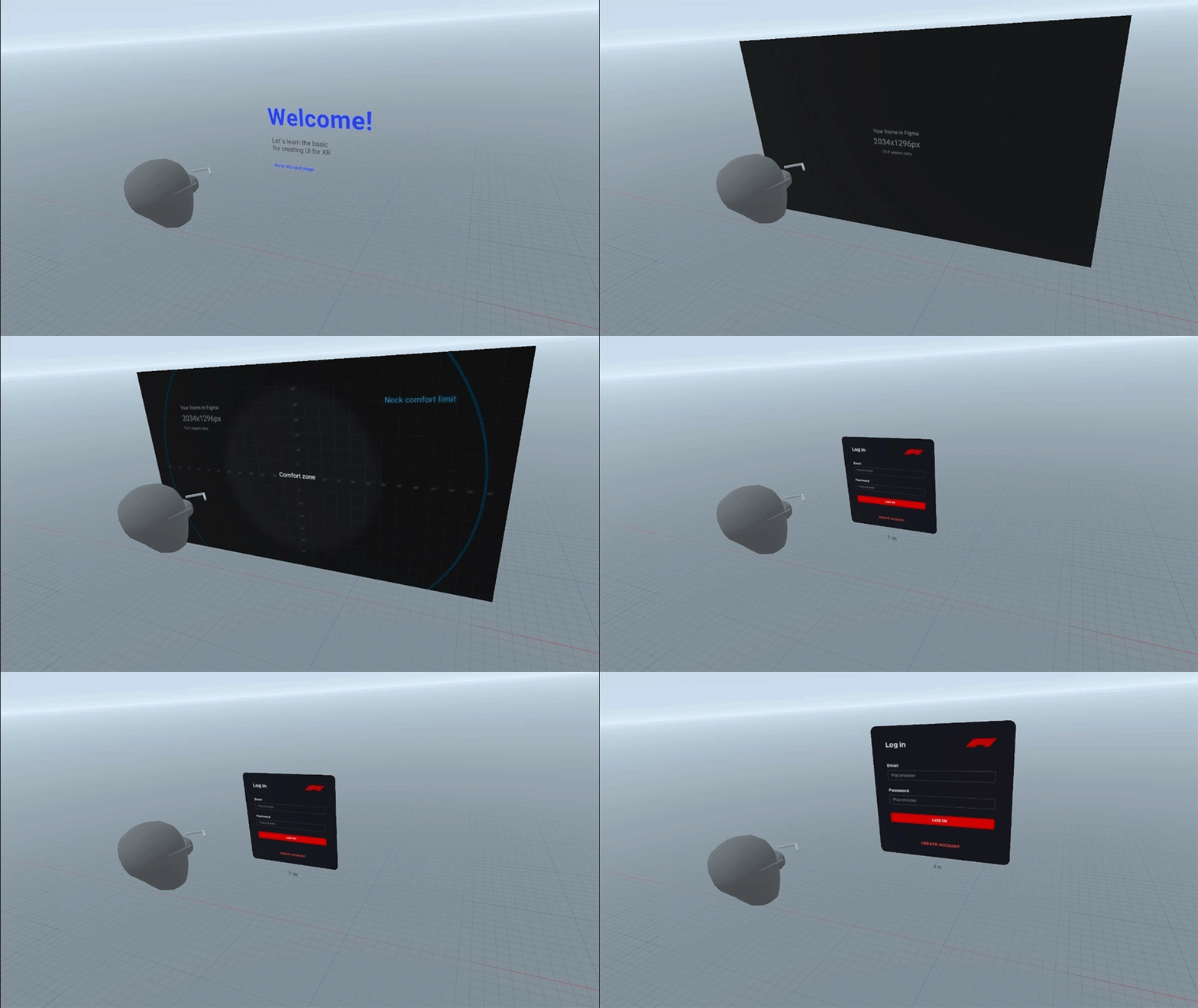
Choosing the Right Size for Your UI in VR
The first thing to consider when designing a UI in a 360-degree virtual environment is the size. Everything in your VR experience should be intuitive and easy to understand, and that starts with the size. If the UI is too small, it will be hard to read and interact with; if it is too big, it may cover the environment and additional content and force people to crane their necks to take things in.
It's important to consider how much of the available space you’re going to use. Unlike other forms of digital design, in 3D we tend to refer to meters and millimeters over pixels. But if you are more comfortable working with pixels, that’s fine. At one meter away, one millimeter is the equivalent of one pixel. So it’s nice and easy to work with either measurement.

The best way to understand how far the user will need to move their eyes or neck is with Figma’s angular grid. With this, you’ll be able to see the exact degrees of each movement and figure out if you’re taking things too far (quite literally).
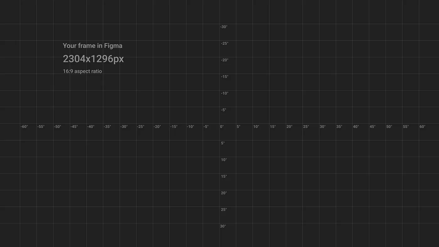
Next, you’ll need to establish how many degrees you can explore before causing discomfort in the eyes or neck. We call this region the comfort zone, because it’s where the user can observe without significant movement of their neck or eyes. Anything that goes outside of the comfort zone will need curving or tilting towards the user.
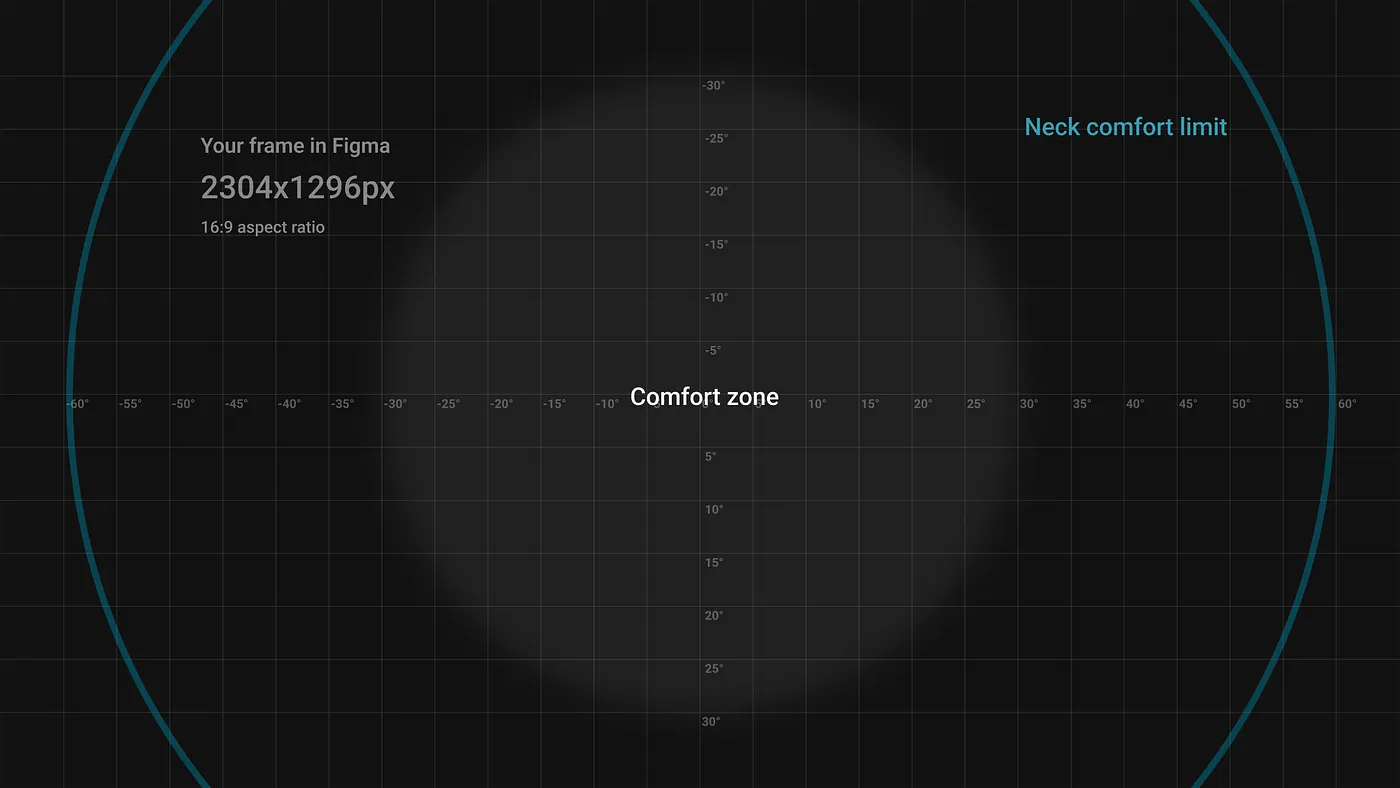
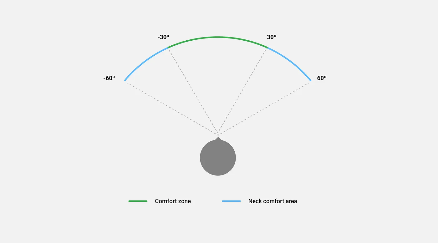
There’s also the neck comfort limit, the point at which turning the neck any further becomes noticeably uncomfortable. This limit lies at the very edge of the user’s peripheral vision, so any content that falls beyond it won’t be visible.
If you want a first-hand experience of viewing different degrees and how it feels to move your eyes or neck around, try using our ShapesXR space. Once in this environment, you’ll be able to personally experience the level of comfort your users will be subjected to within a VR project.
UI areas
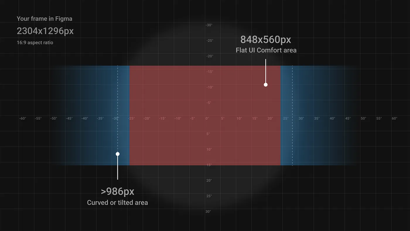
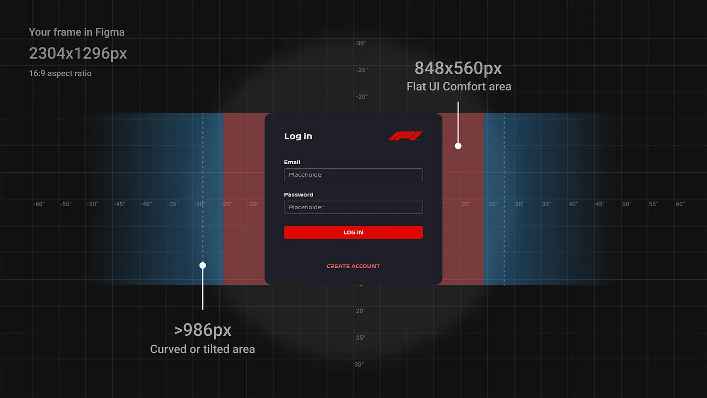
Now that you have the knowledge needed to lay out your UI and determine the size of each component, let’s look at height.
Where to Place Your UI in a VR Setting
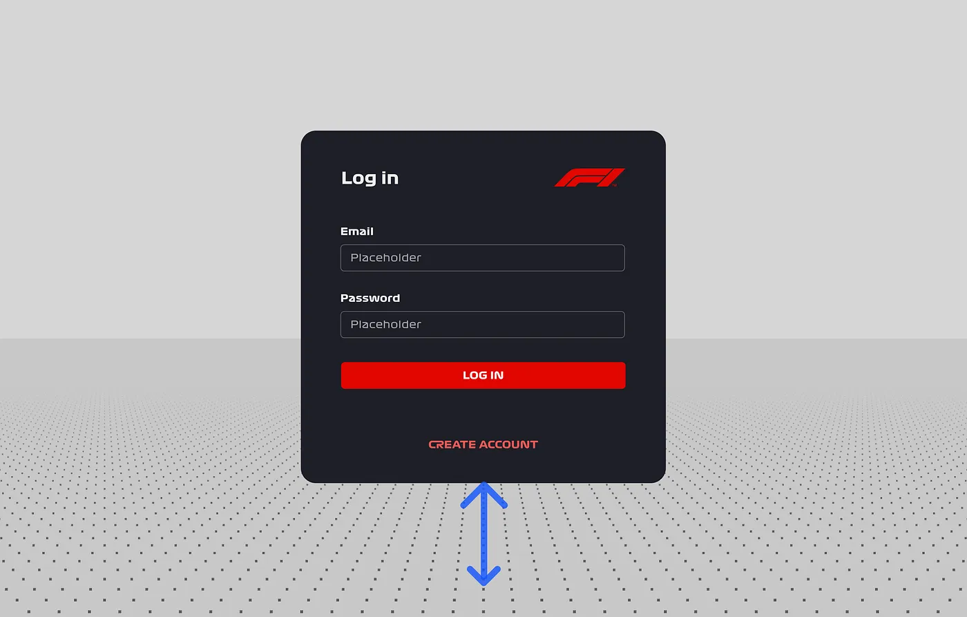
This one’s easy, you just need to place the center of your UI at eye level, right? Actually, it’s not quite that simple. Humans tend to look ever so slightly downward by nature, so aligning your UI with the middle of the eye could cause some discomfort.
Figma doesn’t provide a wealth of options to address this fact, but it is key to a positive user experience. You’ll need to make sure that you pass this on to any developers working on your VR experience.
The best way to really understand this is to experience it for yourself directly in a VR environment. Head to the “Height” section in our ShapesXR Space and see for yourself.
We’ve established how to size your UI component and where to place it in terms of height, now all that’s left is to discuss design across various distances.

Understanding UI Distance
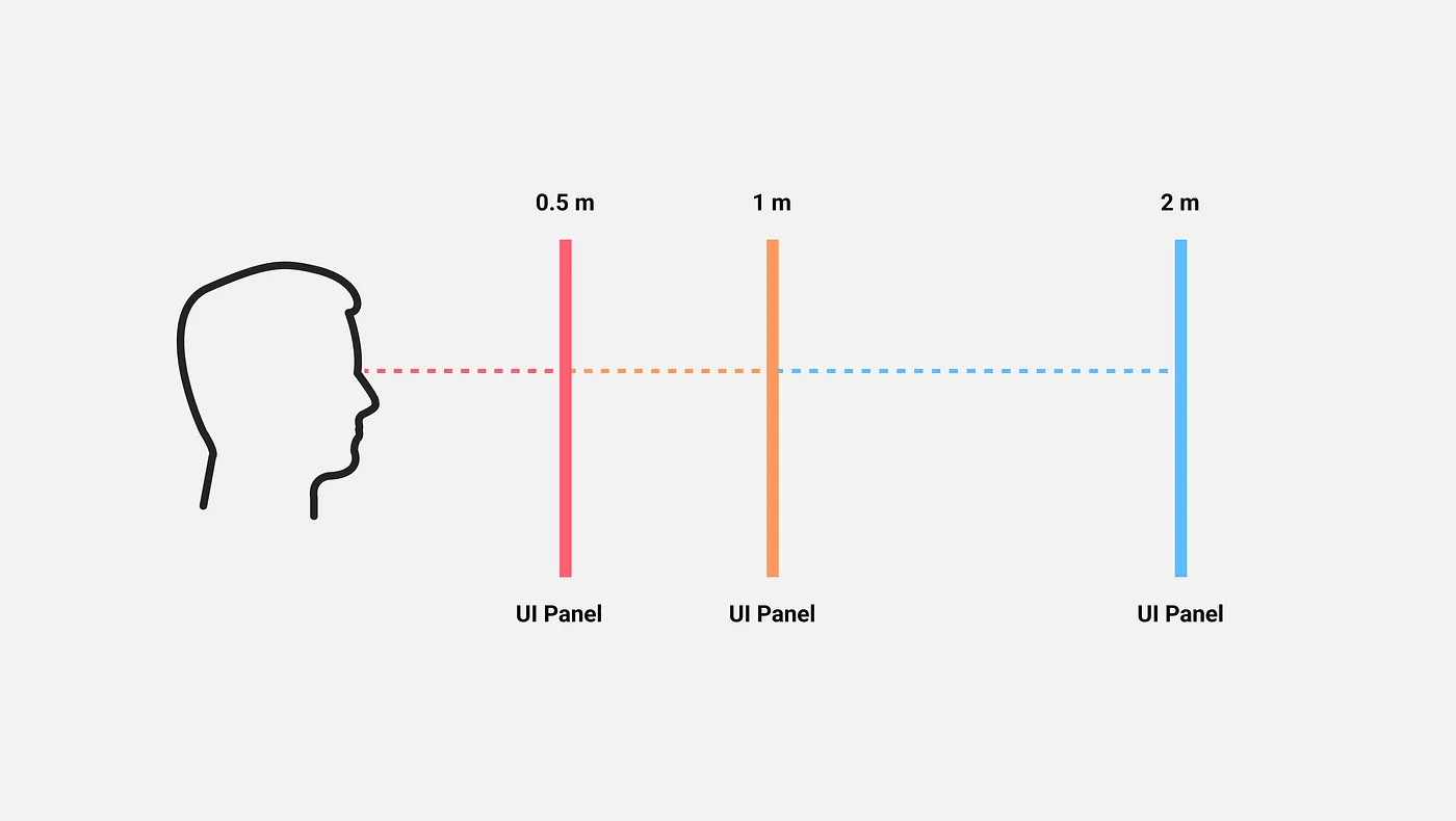
We know what you’re thinking. “This all sounds great, but do I need to completely redesign my UI component for each distance?” The short answer is no. Within Figma, you always design your UI as though it’s going to be seen from a distance of one meter away. If you want your UI to be seen from two meters away, it just needs to be scaled by a factor of two. On the other hand, if you want it to be seen from a distance of 0.5 meters, it would need to be scaled by a factor of 0.5. Regardless of how it is being viewed, the design in Figma stays the same.
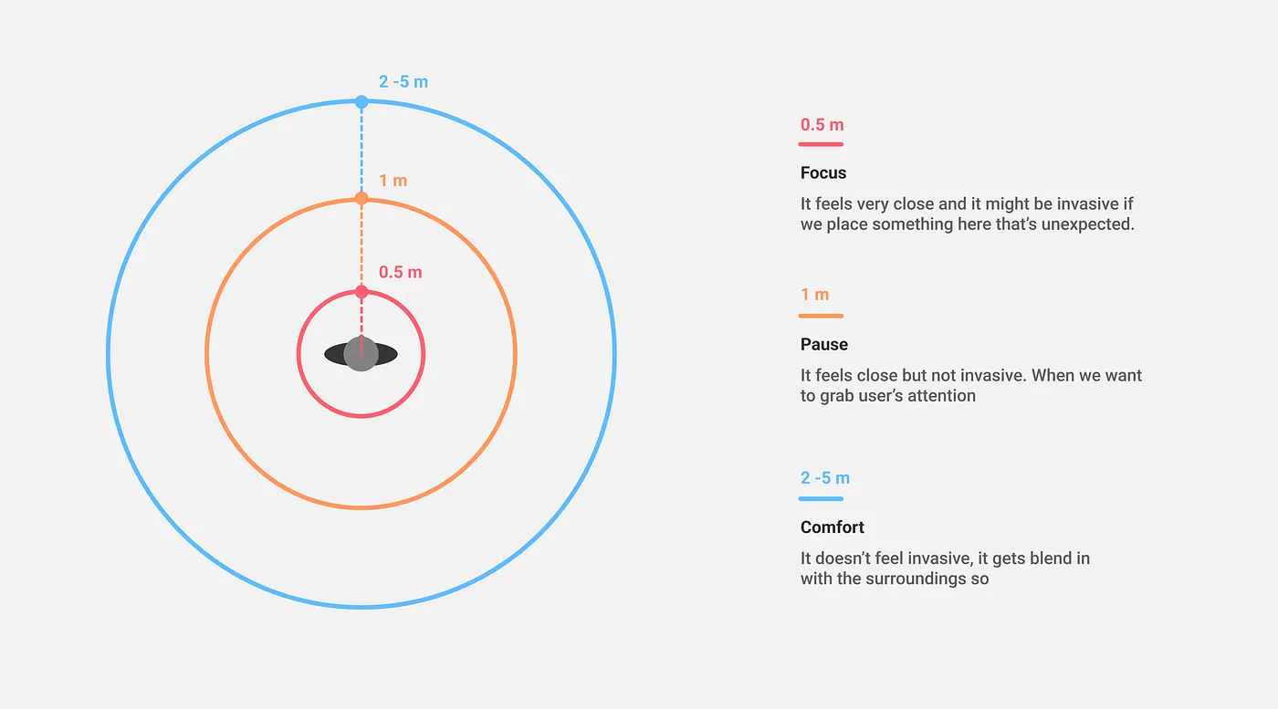
Our ShapesXR Space will help you see how different distances work in VR. A login interface that’s one meter away might not sound that different from an interface that’s two meters away, but it will evoke very different sensations in the user.
What are you waiting for?
If you’ve read this far, you have an understanding of the key concepts needed to design a user-friendly UI for any VR experience. You don’t even need an in-depth understanding of game engines like Unity or Unreal Engine to get started, only the tools and software mentioned in this article.
The other advantage is that everything you have built in ShapesXR can be handed over to developers thanks to a handy Unity plugin streamlining the communication with the engineering team. VR is a tool for everyone to share ideas, concepts, and creations and the best way to learn and improve is to start experimenting right now. So off you go, have fun!
Here are some useful resources to help you on your way:
- ShapesXR VR app
- ShapesXR’s space: Link | Code: 9RD9D4W6
- ShapesXR Figma file


%201.png)


